Build Your First App with Polymer and Web Components
TL;DR: Google Polymer is a library that provides syntactic sugar and polyfills for building elements and applications with web components. We’ll build a web app using Polymer and its CLI, call an external API, and add authentication with JSON Web Tokens. The full code is available from this GitHub repo.
This post is original content developed by me for the Auth0’s blog and has been re-posted here as part of an online portfolio with permission. Relevant attribution and canonical links exist. Click here to see the original.
What Are Web Components?
Components are generally understood to be modular pieces of code that provide UI and/or scripting in a reusable package. Many JS frameworks use the term “components” (e.g., Angular, React, Ember). However, to understand Polymer, we’ll do a quick crash-course on a specific kind of component: web components.
Web components are reusable widgets that can be assembled like building blocks in web documents and apps. They are a set of browser features that are being added to the W3C HTML and DOM specification. A web component is composed of four standards:
In a nutshell, web components allow us to architect and import custom elements that automatically associate JS behavior with templates and can utilize shadow DOM to provide CSS scoping and DOM encapsulation.
Web components can be used natively without any additional libraries or toolsets. However, not all features are supported by all browsers. We need to leverage a library like Polymer or polyfills, such as webcomponents.js, to bridge the gap between the current state of browser support and the future.
Enter Google Polymer
Polymer is a library created by Google that enables us to build cross-browser compatible apps and elements with web components. It provides syntactic sugar to native web components as well as polyfills for browsers that don’t support web components yet. Shadow DOM is difficult and costly to polyfill, so Polymer provides a separate shady DOM polyfill to implement the features of shadow DOM in browsers that lack support.
The web components collection provides many prepackaged custom elements that can be easily implemented in any Polymer project. They provide useful utility elements like Ajax, media queries, and single page application routing as well as the visual “Paper” elements of Google’s Material Design.
Polymer has comprehensive documentation at the Polymer Project Devguide and can be used with or without the custom elements in the Element Catalog. To speed up development, we’ll build our simple Single Page Application (SPA) with a starter kit and Polymer elements.
What We’ll Build
We’re going to develop a Polymer app that does the following:
- calls an external Node API to get Chuck Norris quotes,
- posts to the API to register and log in users,
- uses JSON Web Tokens to fetch protected Chuck Norris quotes for authenticated users,
- stores tokens and user data with local storage,
- and logs users out by clearing tokens.
The full source code for the completed app can be cloned from this GitHub repo.
Setup and Installation
We’ll use the new Polymer CLI to scaffold our Polymer web app with the Polymer Starter Kit. With the starter kit, we’ll gain the advantages of routing, app layout, Material Design, and many core utilities right away.
Let’s get started!
Dependencies
First, make sure that you have node.js (with NPM) installed.
If you don’t already have Bower, install it globally with the following command:
npm install -g bowerInstall the Polymer CLI:
npm install -g polymer-cliWe also need to have a sample Node API running. Clone the NodeJS JWT Authentication sample repo and follow the instructions in the README to get it up and running on http://localhost:3001.
Initializing a Polymer App
Create a new directory and navigate to it in the terminal or command prompt. Use the following command to initialize the Polymer starter kit in your new folder:
polymer init polymer-2-starter-kitThis command installs the starter kit app and necessary Bower components. Once the command completes, we can view the app in the browser by running:
polymer serveThe site runs at http://localhost:8081. Adding the optional --open flag will automatically launch that address in your default browser.
Note: If you want to see the shadow DOM nodes in action in the inspector during development, Chrome is recommended. The app works in all modern browsers thanks to Polymer’s inclusion of shady DOM and polyfills, but Chrome currently has the best native support for web components.
When viewing your app in the browser, it looks like this:
Customizing the Polymer Starter Kit App
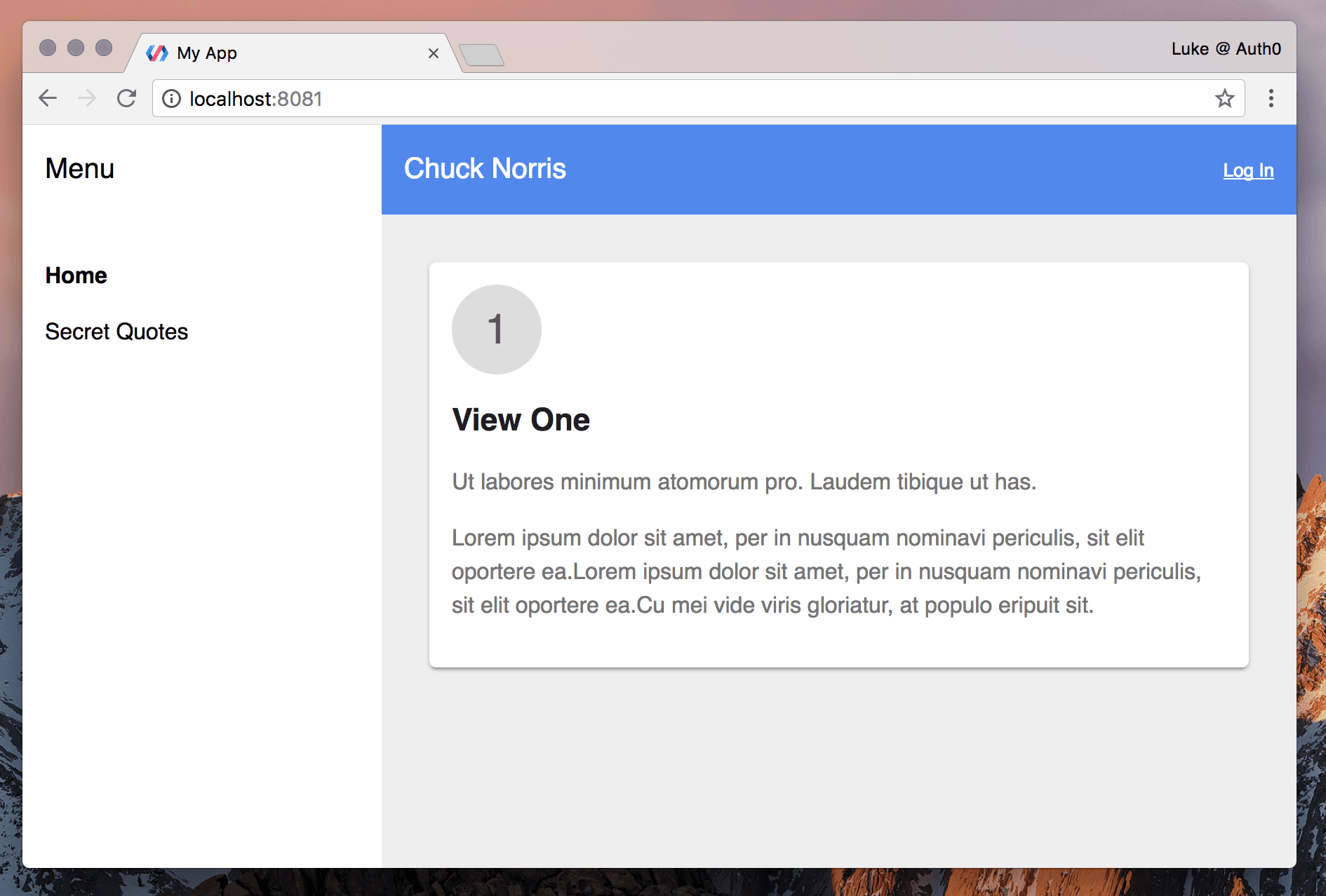
You can see that the starter kit app has several views. We want to customize it. When we’ve finished updating the structure and naming, our app should look like this:
Let’s dig into the code to understand how Polymer applications and elements are composed and how we can modify it to suit our needs.
Element Naming
Open the /src folder and take a look at its contents. These are the elements and views that make up the application. Notice that the file names are hyphenated (ie., my-app, my-view1). This follows the W3C valid custom element naming spec.
Custom element names must contain at least one hyphen.
The my-app.html file contains the main module that renders the other views based on the route (with app-route and iron-pages). The name my-app suits our purposes so we’ll leave it as-is. The same goes for my-icons and shared-styles. However, my-view1 is not descriptive enough. We’ll rename these files and in doing so, learn about more Polymer elements.
Renaming HTML Files
Our app will be composed of the following views:
- A homepage that lets visitors click a button to display random Chuck Norris quotes.
- A signup and login page with a form that lets visitors register or log into the app.
- A secret quotes page where authenticated users can click a button to get protected Chuck Norris quotes.
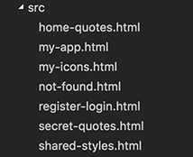
We’ll rename the generic starter kit views to match our planned view structure. The /src folder currently looks like this:

Let’s rename these files:
/src
  |-- my-view1.html
  |-- my-view2.html
  |-- my-view3.html
  |-- my-view404.html
to the following:
/src
  |-- home-quotes.html
  |-- register-login.html
  |-- secret-quotes.html
  |-- not-found.html
Our final file /src folder file structure should look like this:
Editing the Views
We’ve renamed the HTML files and now we need to rename the elements they contain. For each of the updated views, open the file and do the following:
Locate the <dom-module> tag near the top of the file. This specifies the start of an element’s DOM template. This is the declarative portion of the element definition. Change its ID to match the new file name.
For example:
<dom-module id="my-view1">becomes:
<dom-module id="home-quotes">Locate the <script> tag near the bottom of the file. The extends Polymer.Element javascript class is the imperative portion of the element definition. Change the is function to return the new element name and the class name to something more appropriate.
For example:
class MyView1 extends Polymer.Element {
    static get is() { return 'my-view1'; }
}

window.customElements.define(MyView1.is, MyView1);
becomes:
class HomeQuotes extends Polymer.Element {
    static get is() { return 'home-quotes'; }
}

window.customElements.define(HomeQuotes.is, HomeQuotes);
Note: Read more about an element’s shadow DOM in the Polymer docs.
Modifying my-app.html
Our elements are renamed. Now we need to update references to them. The view elements are called in /src/my-app.html, so we’ll make the necessary changes while familiarizing with the contents of the file.
Routing is handled by <app-location>, <app-route>, and <iron-pages>. Consult the documentation to learn more about Polymer routing.
To get our renamed views working with routing, locate the <app-drawer> element. This is the menu sidebar and currently contains links to the old routes, like so:
<a name="view1" href="[[rootPath]]view1">View One</a>You may notice that the hyphenation (my-) is missing. It’s being added programmatically and we’ll need to remove it soon. First, change the anchor links inside the <iron-selector> element to match our renamed views for home-quotes and secret-quotes:
...
<iron-selector selected="[[page]]" attr-for-selected="name" class="drawer-list" role="navigation">
  <a name="home-quotes" href="[[rootPath]]home-quotes">Home</a>
  <a name="secret-quotes" href="[[rootPath]]secret-quotes">Secret Quotes</a>
</iron-selector>
...
The “Log In” link would be best located in the header. Find the header layout elements <app-header> and <app-toolbar>. Add the Log In link after the <div main-title>My App</div> element. While we’re here, let’s change the main title to “Chuck Norris” too. When we’re done, the <app-toolbar> element should look like this:
...
<app-toolbar>
  <paper-icon-button icon="my-icons:menu" drawer-toggle></paper-icon-button>
  <div main-title>My App</div>
  <a name="register-login" href="[[rootPath]]register-login">Log in</a>
</app-toolbar>
...
Now we’ll update the markup that places our view elements in the DOM. Locate the <iron-pages> tag. This element shows one of its children at a time and is used in conjunction with <app-route> to display views based on the URL. Update the elements inside this tag to reflect the renaming of our view elements:
...
<iron-pages
    selected="[[page]]"
    attr-for-selected="name"
    fallback-selection="not-found"
    role="main">
  <home-quotes name="home-quotes"></home-quotes>
  <register-login name="register-login"></register-login>
  <secret-quotes name="secret-quotes"></secret-quotes>
  <not-found name="not-found"></not-found>
</iron-pages>
...
Now we’ll make some changes in the Polymer function. This method takes an object prototype for a new element. You can read more about registering elements in the docs.
In the <script> tag, locate the _routePageChanged() function and change the default this.page to home-quotes:
...
_routePageChanged(page) {
  // If no page was found in the route data, page will be an empty string.
  // Default to 'home-quotes' in that case.
  this.page = page || 'home-quotes';

  // Close a non-persistent drawer when the page & route are changed.
  if (!this.$.drawer.persistent) {
    this.$.drawer.close();
  }
}
...
Next, find the _pageChanged() function. This is where the page URL is being prefixed with my-. Update the resolveUrl variable:
...
_pageChanged(page) {
  // Load page import on demand. Show 404 page if fails
  var resolvedPageUrl = this.resolveUrl(page + '.html');
  Polymer.importHref(
      resolvedPageUrl,
      null,
      this._showPage404.bind(this),
      true);
}
...
Finally, update the _showPage404() function’s this.page declaration to not-found to match our renamed element:
...
_showPage404() {
  this.page = 'not-found';
}
...
Update polymer.json
Open the /polymer.json file. This file contains the build settings for our app when using the Polymer CLI. We’ll update the fragments array with our renamed views. These are HTML files that are loaded on-demand or asynchronously.
// polymer.json
...
"fragments": [
  "src/home-quotes.html",
  "src/register-login.html",
  "src/secret-quotes.html",
  "src/not-found.html"
],
...
Click between the routes to make sure everything works. We’re now ready to start developing the features of our app.
Building a Polymer Element
We’ll start with the home view. When we’re finished with this step, our app should look like this:

Open the /src/home-quotes.html file. This is our home-quotes custom element. Right now it contains some lorem ipsum and lacks JS functionality beyond instantiation. We’ll add an Ajax call to the Chuck Norris API and bindings to display the response on the page. We’ll also add a button to get a new random quote when clicked.
HTML Imports
The first thing we’ll do is install some Polymer elements. We can leverage iron-ajax to call the API and paper-button for the UI.
Install these components using Bower:
bower install PolymerElements/iron-ajax PolymerElements/paper-button --saveWe need to import the elements into home-quotes using HTML imports. Since we’re building web components, we want to import all the dependencies for a specific element in that element’s HTML file. We don’t want to rely on a parent element loading them first–that could create a missing dependency somewhere down the line.
Doing this would be dangerous if we were loading scripts in the traditional way: we might get the same dependency called multiple times throughout the app. We would need to centralize file requests or use a dependency manager. However, with web components, we don’t need to worry about loading the same imports multiple times because HTML imports dedupe: if an HTML import has already been loaded, it skips loading it again.
The Polymer library and shared-styles element are already being imported in our home-quotes element. We’ll add the two elements we just installed with Bower:
<!-- home-quotes.html -->
...
<link rel="import" href="../bower_components/iron-ajax/iron-ajax.html">
<link rel="import" href="../bower_components/paper-button/paper-button.html">
Now we can take advantage of these elements.
Calling an API with iron-ajax
Make sure you have the Chuck Norris Node API cloned and running so that the API is accessible on http://localhost:3001.
We’re going to call the API using HTML. The only JavaScript we need to write in this element will be a simple handler to re-send the Ajax request when a button is clicked. Pretty cool, huh?
After the closing </style> tag (we’ll come back to styling shortly), add the following iron-ajax element:
<iron-ajax
  id="getQuoteAjax"
  auto
  url="http://localhost:3001/api/random-quote"
  method="get"
  handle-as="text"
  last-response="{{quote}}">
</iron-ajax>
Note: It’s always worthwhile to take a look at the source code for any custom elements you’re using, including Polymer elements.
We gave iron-ajax a descriptive id so we can access its instance in JS using this.$.getQuoteAjax. Setting the auto attribute re-sends the request anytime the URL or parameters change. For our purposes, this fetches a quote when the element first loads. Since we won’t change the URL or parameters again after initialization, we’ll generate subsequent requests with a button click handler. We’re using the GET method. The API returns the response as a string, so we’ll set handle-as="text" (other options include xml, json, blob, etc.).
Finally, last-response can bind the response from the most recent request. We’re automatic/two-way data binding it to a property called quote with double curly braces as delimiters. iron-ajax is bundled with a dependency element called iron-request which performs the Ajax request. The response needs to be two-way bound to communicate up and down between the request and our instance of the iron-ajax element. You can read more about data flow in Polymer here.
Binding and Fetching Quotes
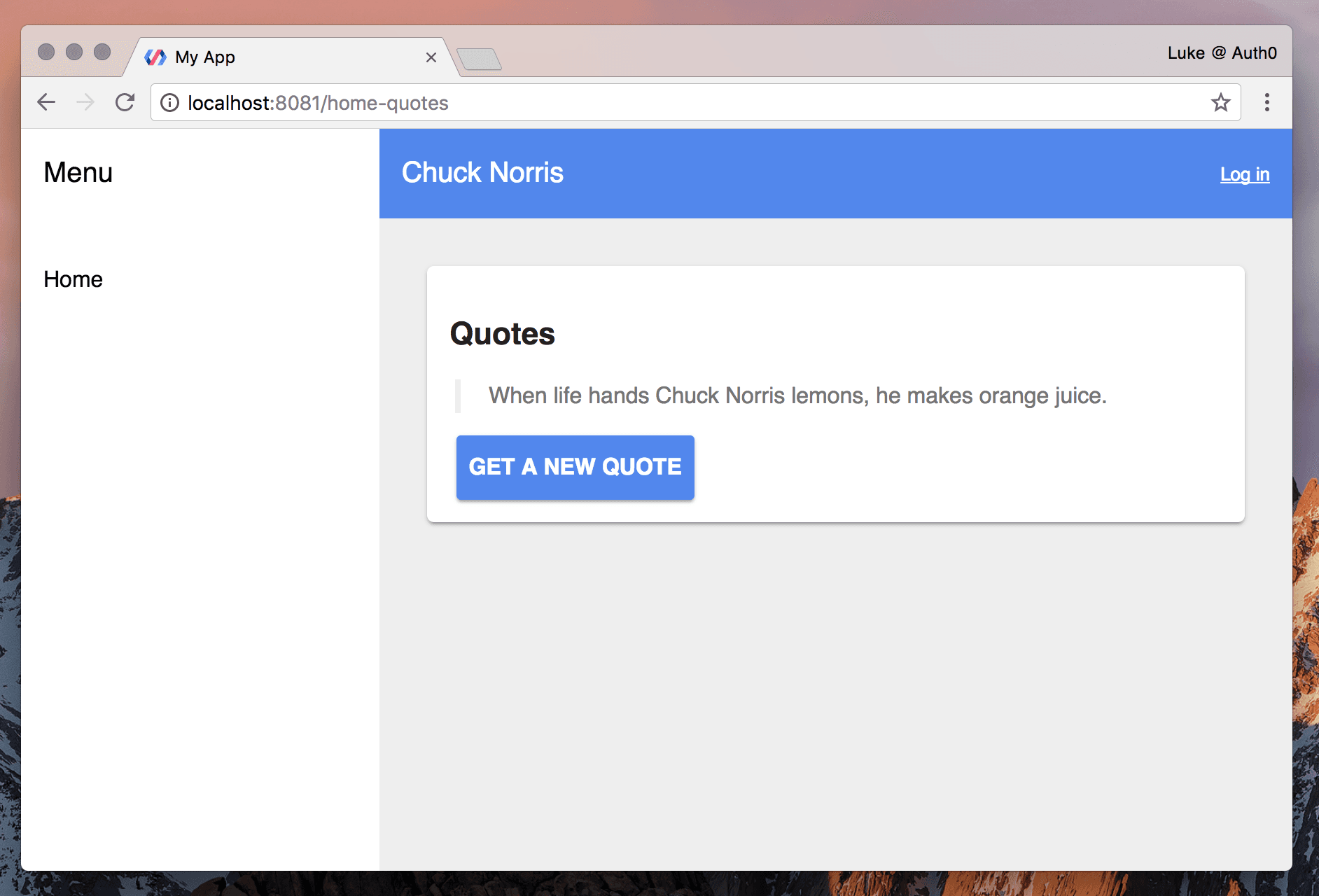
We now have the response from the API. We need to display the quote in the view. Locate the card div <div class="card"> and delete the lipsum contents.
Add a heading and a <blockquote>. Inside the blockquote element, one-way bind the quote API response using double square bracket delimiters ([[quote]]). We’re using one-way binding here because data is flowing downward from host to target but not upwards. In order to get new quotes, let’s add a button below the blockquote.
<div class="card">
  <h1>Quotes</h1>
  <blockquote>[[quote]]</blockquote>
  <paper-button raised on-tap="getQuote" class="primary">Get a New Quote</paper-button>
</div>
Check out the paper-button documentation to read about button styling and API. We’ve added an on-tap event listener so when we click or tap the button, we can request another quote from the API by executing a function.
In our JS, let’s add the getQuote() function and generate another Ajax request. We’ll use the iron-ajax method generateRequest() to do this. Remember, we can reference this instance by its ID:
class HomeQuotes extends Polymer.Element {
    static get is() { return 'home-quotes'; }

    getQuote() {
        this.$.getQuoteAjax.generateRequest();
    }
}

window.customElements.define(HomeQuotes.is, HomeQuotes);
We should now be able to click the “Get a New Quote” button in our app to get and display random Chuck Norris quotes.
Styling
Web component elements use shadow DOM styling rules. Styles defined in the shadow root are local. This means we can target IDs and classes within our custom element without contaminating the rest of the page or application.
The quote and button look a bit shabby so let’s spruce them up with CSS. Head back up to the top of the /src/home-quotes.html file and find the <style> tag. Notice that this tag includes the shared-styles element. Since we’ll be using the blockquote and paper-button styles elsewhere in the app for the secret-quotes element too, we’ll want to put our styles somewhere they can be accessed globally.
Open /src/shared-styles.html. We can add our common styles here as well as clean up some CSS we won’t be using anymore.
Delete the .circle ruleset and add the following:
...
:root {
  --primary-color: #4285f4;
}
a,
paper-button {
  font-weight: bold;
}
a {
  color: var(--primary-color);
}
paper-button {
  color: #fff;
}
paper-button.primary {
  background: var(--primary-color);
}
blockquote {
  border-left: 4px solid #eee;
  margin-left: 4px;
  padding-left: 20px;
}
As you can see, we can use custom CSS properties with Polymer:
:root {
	--primary-color: #4285f4;
}
...
a {
	color: var(--primary-color);
}
...
paper-button.primary {
	background: var(--primary-color);
}
Many of Polymer’s Material Design Paper elements can be customized by setting variables. We can also create our own. We’ll set the primary color on the :root selector so that it applies to all custom elements. We’ll then use the variable to style our paper-button element with a .primary class.
Note: By setting the
--primary-colorvariable now, the focus color for inputs will also be preset when we usepaper-input-containerlater.
Now the .primary class that we added to our button will be styled in the home-quotes element.
Authenticating Users in a Polymer App
Users should be able to register so they can log in and access secret quotes. We’ll create a form for visitors to enter credentials and POST data to the API to sign up or log in and receive a JWT access token. We also need to handle sign up and login errors as well as save to local storage to persist logins.
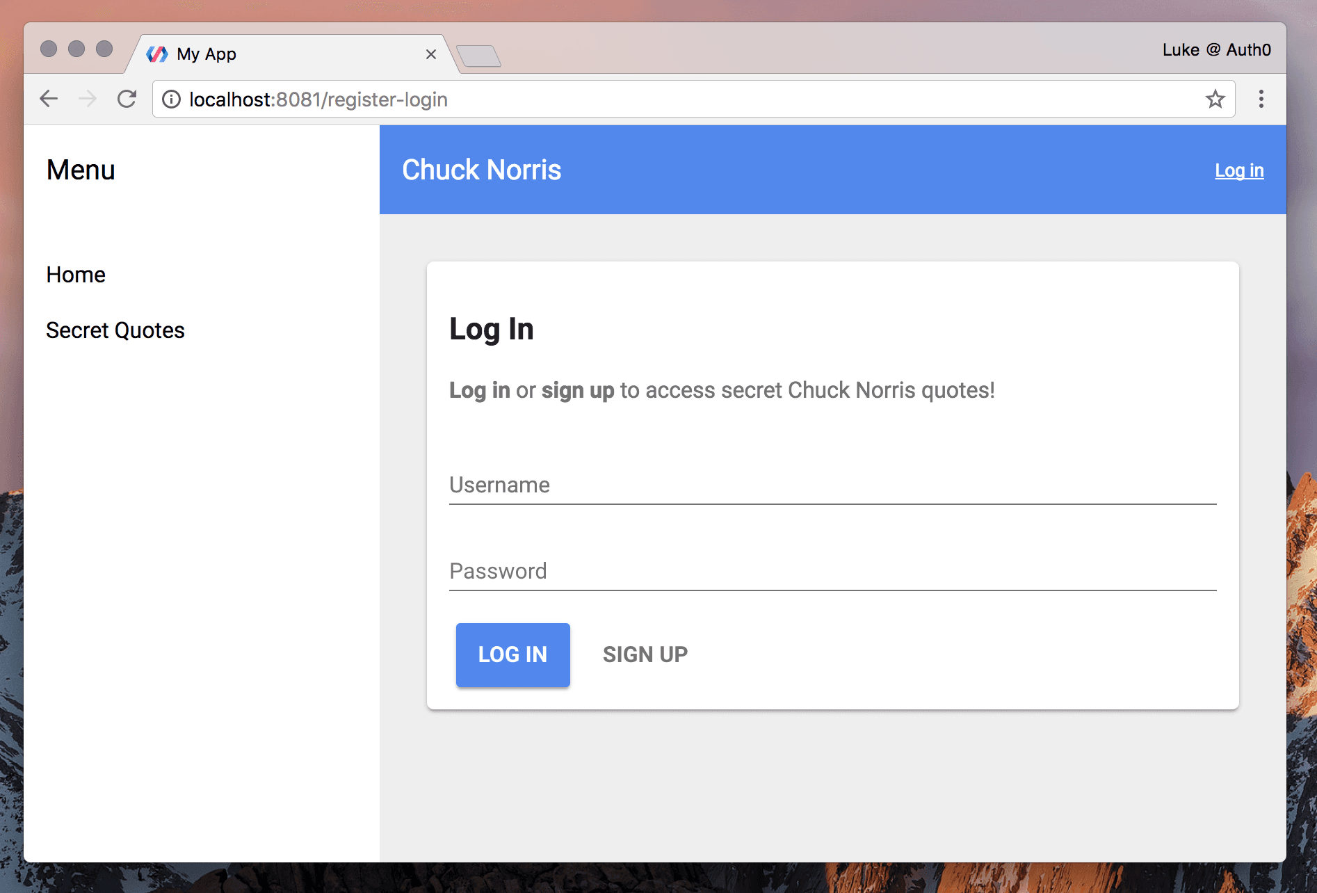
When this step is complete, our login view will look like this:
Creating the User Credentials Form
Open /src/register-login.html. This is our register-login element. We’ll use some more Polymer elements from the catalog, so let’s start by installing iron-input and paper-input:
bower install PolymerElements/iron-input PolymerElements/paper-input PolymerElements/iron-localstorage --saveNow we’ll import these new dependencies along with iron-ajax, paper-button, and iron-localstorage. We don’t need to install iron-localstorage with Bower because it came packaged with the starter kit.
Note: You can check your
/bower_componentsdirectory to see what other Polymer components are automatically installed.
The HTML imports for register-login should now look like this:
<!-- register-login.html -->

<link rel="import" href="../bower_components/polymer/polymer-element.html">
<link rel="import" href="../bower_components/iron-ajax/iron-ajax.html">
<link rel="import" href="../bower_components/iron-localstorage/iron-localstorage.html">
<link rel="import" href="../bower_components/iron-input/iron-input.html">
<link rel="import" href="../bower_components/paper-input/paper-input.html">
<link rel="import" href="../bower_components/paper-button/paper-button.html">
<link rel="import" href="shared-styles.html">
First we’ll set up the basic markup for the form with a username and password. Logging in and signing up require the same fields so we’ll use the same form for both.
Note: A potential future enhancement might be to split register and login into separate views and add a Confirm Password field when signing up.
Delete the lorem ipsum inside the <div class="card"> element. We want to create two potential UIs for this area: one for if the user is authenticated and one for if they aren’t. We’ll start with the unauthenticated view, which is the register / login form.
Create a container for the unauthenticated UI and add input elements using iron-input and paper-input-container, which comes bundled with paper-input. The reason we aren’t using paper-input by itself is because iron-input allows us to two-way bind input values. It also provides validation options. We won’t do validation in this tutorial, but using this element provides more room for extensibility. Using paper-input-container applies Material Design styles to labels and inputs. This way we can utilize both the iron element utilities and the paper element styles.
Our initial markup should look like this:
<div class="card">
<div id="unauthenticated">
<h1>Log In</h1>
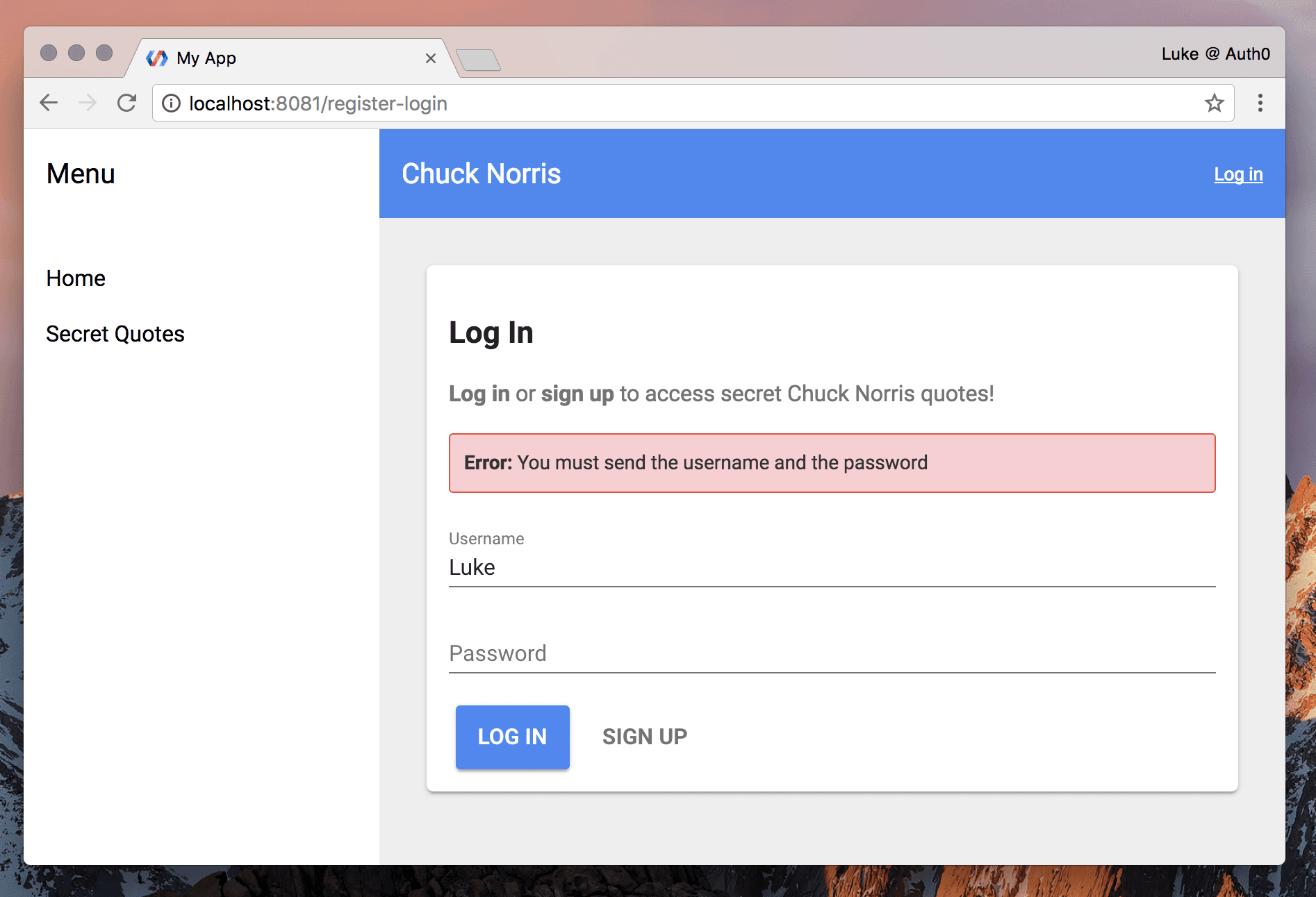
<p><strong>Log in</strong> or <strong>sign up</strong> to access secret Chuck Norris quotes!</p>
<paper-input-container>
<label slot="input">Username</label>
<iron-input slot="input" bind-value="{{formData.username}}">
<input id="username" type="text" value="{{formData.username}}" placeholder="Username">
</iron-input>
</paper-input-container>
<paper-input-container>
<label>Password</label>
<iron-input slot="input" bind-value="{{formData.password}}">
<input id="password" type="password" value="{{formData.password}}" placeholder="Password">
</iron-input>
</paper-input-container>
<div class="wrapper-btns">
<paper-button raised class="primary" on-tap="postLogin">Log In</paper-button>
<paper-button class="link" on-tap="postRegister">Sign Up</paper-button>
</div>
</div>We’ll also add some local CSS in the <style> tags:
...
.wrapper-btns {
	margin-top: 15px;
}
paper-button.link {
	color: #757575;
}
Now we have a form, but it doesn’t do anything. We’ll wire it up with JS to take advantage of iron-input and bind the values to data that we can submit to the API. Create a property that holds an object for our form data:
...
class RegisterLogin extends Polymer.Element {
  static get is() { return 'register-login'; }

  static get properties() {
    return {
      formData: {
        type: Object,
        value: {}
      }
    }
  }
}
...
Polymer properties are members of the element’s public API and can be declared on the prototype. We’ll set the default value of formData to an empty object so we can add properties to it simply by typing in the input fields.
Note: Why weren’t we required to declare
quoteas a property in thehome-quoteselement? The fetchedquoteis not a member of the element’s public API and did not need a default value or options. Thequoteproperty could be added as typeStringtohome-quotesto no ill effect, but it was left off to demonstrate that Polymer will bind without it and there is no need to expose it to the element’s API: we won’t set the quote as an attribute when calling the<home-quotes>element.
We already bound the formData object to the inputs in the HTML using bind-value attributes. This allows the data to flow between the markup (declarative API) and the JS (imperative API).
Submitting the Form with Ajax
We’ll use iron-ajax again to post our form data to the API to register or log in users:
<iron-ajax
	id="registerLoginAjax"
	method="post"
	content-type="application/json"
	handle-as="text"
	on-response="handleUserResponse"
	on-error="handleUserError">
</iron-ajax>
We’ll use the POST method and set the content type to JSON. We’re going to handle the response as text because although a successful login returns JSON, a failure returns a string. This way we can easily parse the JSON on success or handle plain text in case of an error.
There is no url attribute on our iron-ajax element this time. We’ll set the URL based on whether the user clicks “Log In” or “Sign Up”. We’ve already added on-tap attributes to the two buttons to attach handlers.
Now we’ll add the corresponding postLogin() and postRegister() event handlers to the JS. We also need to set the request body containing the form data when the user clicks a button to submit. Then we’ll generate the Ajax request. Add the following to the Polymer() function in the JS:
...
_setReqBody() {
  this.$.registerLoginAjax.body = this.formData;
}

postLogin() {
  this.$.registerLoginAjax.url = 'http://localhost:3001/sessions/create';
  this._setReqBody();
  this.$.registerLoginAjax.generateRequest();
}

postRegister() {
  this.$.registerLoginAjax.url = 'http://localhost:3001/users';
  this._setReqBody();
  this.$.registerLoginAjax.generateRequest();
}
...
Handling API Responses
We’re successfully POSTing to the API. Next we need to handle the API response. At this time, we have listener methods defined in the markup but not in the JS:
<iron-ajax
	...
	on-response="handleUserResponse"
	on-error="handleUserError"></iron-ajax>
Let’s add handleUserResponse() and handleUserError():
static get properties() {
  return {
    ...
    storedUser: Object,
    error: String
  }
}
...
handleUserResponse(event) {
  var response = JSON.parse(event.detail.response);

  if (response.id_token) {
    this.error = '';
    this.storedUser = {
      name: this.formData.username,
      id_token: response.id_token,
      access_token: response.access_token,
      loggedin: true
    };
  }

  // reset form data
  this.formData = {};
}

handleUserError(event) {
  this.error = event.detail.request.xhr.response;
}
...
We’re adding two more properties: storedUser (an object to store name, id token, access token, and state of an authenticated user), and error (a string to display when the API returns a failure). Later we’ll add storedUser to local storage and access it in other areas of the app. We can use shorthand property: [Type] because we don’t need any additional options set.
Next we’ll handle a successful API response: handleUserResponse(). Recall that we’re handling all responses as text, so we need to parse the JSON. If a token is present we’ll clear any errors from previous failures, define the storedUser object and its properties, and reset formData to an empty object.
We’ve also defined a handler for errors: handleUserError(). When the sample API fails, it returns an error message as a string. We’ll set the error property to this XHR response. You can console.log() the event parameter in these two handlers to become more familiar with its structure.
Now we have the error message but we’re not displaying it to the user. We’d like to show something like this:
Let’s add some markup after the instructions paragraph to support this:
...
<template is="dom-if" if="[[error]]">
	<p class="alert-error"><strong>Error:</strong> [[error]]</p>
</template>
...
```html

Templates with `is="dom-if"` are [conditionally stamped](https://www.polymer-project.org/2.0/docs/devguide/templates#dom-if) when their `if` property is truthy.

We can now see an error message if we try to submit empty or invalid credentials to the API. Let's add some styling to make error messages more prominent. Add the following ruleset to the `register-login` element's local `<style>` tag:

```css
...
.alert-error {
	background: #ffcdd2;
	border: 1px solid #f44336;
	border-radius: 3px;
	color: #333;
	font-size: 14px;
	padding: 10px;
}
Saving Data to Local Storage
To persist user sessions, add the iron-localstorage element near the top of our element markup:
<iron-localstorage name="user-storage" value="{{storedUser}}"></iron-localstorage>Now users don’t have to log in repeatedly after refresh or return visit.
Showing UI Based on Authentication State
We’re now authenticating, but there’s no indication to the user that they’re logged in. We’ll hide the form and show a message upon successful authentication.
Add a hidden attribute to the #authenticated div:
<div id="unauthenticated" hidden$="[[storedUser.loggedin]]">We want hidden to have a binding and be conditionally applied. If we don’t do this, its presence implies truthiness regardless of its value. To bind to an attribute, we need to add a dollar sign $ after the attribute name.
We’ll show the user a logged-in UI if they’re authenticated. Add another div:
...
<div id="authenticated" hidden$="[[!storedUser.loggedin]]">
	<h2>Hello, [[storedUser.name]]!</h2>
	<p>You are currently logged in. You can access <a href="[[rootPath]]secret-quotes">Secret Quotes</a>!</p>
</div>
Now when the user logs in, they won’t see the form anymore and will see this greeting instead. However, we can take this one step further and redirect them to the Secret Quotes view on successful authentication.
Redirecting After Authentication
To redirect the user to another view with Polymer app routing in place, we need to include the app-location element. This synchronizes browser location and application state and gives us access to a route object.
Add app-location to the imports at the top of the file. It’s already installed because it came bundled with the starter kit (we’ve seen it in /src/my-app.html):
<link rel="import" href="../bower_components/app-route/app-location.html">Now add the element:
<app-location route="{{route}}"></app-location>In our handleUserResponse() function, we can now set the route.path to the path we want to redirect to:
handleUserResponse(event) {
	...
	if (response.id_token) {
		...
		// redirect to Secret Quotes
		this.set('route.path', '/secret-quotes');
	}
	...
},
Note: Using
this.set('property.subproperty', ...)instead ofthis.property.subproperty =ensures that we’re making observable changes to object subproperties.
Making User Data Available Globally
What if we want to access and manipulate user authentication state from other areas of the app? For instance, the header still says “Log In” when the user is authenticated. We should change this to a greeting and a “Log Out” button. We can also see “Secret Quotes” in the menu while logged out. This should be hidden from unauthenticated users. But most importantly, we need to use the authenticated user’s token to access the protected API to get secret quotes.
Recall that iron-localstorage has a binding to storedUser which is a property of the register-login element. Even though local storage is accessible globally, we don’t have a simple way to be sure that changes are observed on all parents and children throughout the app.
Polymer does not have an elegant, out-of-the-box solution to this problem at this time. This is something any full-featured JS framework would make short work of, but it’s important to remember that Polymer is not a framework: it’s a library that helps us leverage web components.
To solve this, we’re going to install and use the component brum-global-variable. This makes data available across the application and notifies on changes.
bower install SieBrum/brum-global-variable --saveNote: To learn more about
brum-global-variablecheck out its docs.
In /src/register-login.html, import the new brum-global-variable dependency:
<link rel="import" href="../bower_components/brum-global-variable/brum-global-variable.html">Add the brum-global-variable element to the markup. We need to supply an identifying key and the value we want is, of course, the storedUser object.
<brum-global-variable key="userData" value="{{storedUser}}"></brum-global-variable>We can now add the brum-global-variable element to any other components that need access to this global data. All instances will be notified when the data is changed.
Creating a Log Out Element
Now that we can register and authenticate users, we need a way for them to log out. This should be a component that can live in a couple of locations, so we’re going to build a new element.
Create a new file: /src/log-out.html. Import Polymer, paper-button, and brum-global-variable:
<!-- log-out.html -->

<link rel="import" href="../bower_components/polymer/polymer-element.html">
<link rel="import" href="../bower_components/paper-button/paper-button.html">
<link rel="import" href="../bower_components/brum-global-variable/brum-global-variable.html">
Now we’ll scaffold our new element by adding <dom-module id="log-out">. We’ll set up the <template>, <style>, and <script> tags as well. The :host styles should have no margin or padding.
<dom-module id="log-out">
  <template>
    <style>
      :host {
        margin: 0;
        padding: 0;
      }
    </style>
    <!-- MARKUP GOES HERE -->
  </template>

  <script>
      (function() {
          class LogOut extends Polymer.Element {
              static get is() {
                  return 'log-out';
              }
          }

          window.customElements.define(LogOut.is, LogOut);
      }());
  </script>
</dom-module>
Here are our plans for the log-out element:
- Display a log out link in the app’s global header when the user is authenticated.
- Display a log out button in the authenticated
register-loginview. - When the link or button is clicked, clear the user’s token and information from global app data.
- Call the element, pass in the
storedUser, and be able to add an optionallinkattribute to toggle thepaper-buttonstyling between button and text.
Keeping these requirements in mind, let’s build out our element, starting with the markup:
<brum-global-variable key="userData" value="{{storedUser}}"></brum-global-variable>

<template is="dom-if" if="{{!link}}">
  <paper-button raised class="indigo" on-tap="logout">Log Out [[[storedUser.name]]]</paper-button>
</template>

<template is="dom-if" if="{{link}}">
  <paper-button class="link" on-tap="logout">Log Out [[[storedUser.name]]]</paper-button>
</template>
This should look familiar. We’re accessing brum-global-variable so when we log out, changes to the data are set throughout the app. We’ll check for a link property and if it’s false, show a different button. Both buttons will call the same on-tap handler, logout().
Note: You may have noticed that we didn’t include
iron-localstorage. Changes tostoredUserinlog-outusebrum-global-variableto notify other instances which updateiron-localstorage. In turn, local storage is retrieved by the parent upon app initialization and the property is then sent to the childlog-outvia itsstored-userattribute.
Here’s the JS to facilitate our required log-out behavior:
class LogOut extends Polymer.Element {
...
    static get properties() {
        return {
            storedUser: Object,
            link: {
                type: Boolean,
                value: false
            }
        }
    }

    logout() {
        this.storedUser = null;
    }
}
The storedUser object will be passed into the element from the parent but we’ll need to manipulate it to perform logout. The link property will be true if it’s present as an attribute on the <log-out> element. The default value of a boolean property must be set to false in order for it to function as an attribute that can be configured by markup.
To log out, all we need to do is set the storedUser object to null.
Now let’s finish up by adding some styles:
:host {
  margin: 0;
  padding: 0;
}
paper-button {
  color: #fff;
}
paper-button.link {
  color: #fff;
  display: inline-block;
  font-size: 13px;
}
paper-button.indigo {
  background-color: var(--paper-indigo-500);
  color: white;
  --paper-button-raised-keyboard-focus: {
    background-color: var(--paper-pink-a200) !important;
    color: white !important;
  };
}
paper-button.indigo:hover {
  background-color: var(--paper-indigo-400);
}
The link style will display in the blue header area so the text should be white. If we need to add additional links in other contexts, we can always adjust the styling to add variables or other options.
Now that we have our log-out element, let’s add it to the /src/register-login.html view:
<!-- register-login.html -->

<div id="authenticated" hidden$="[[!storedUser.loggedin]]">
	...
	<log-out stored-user="{{storedUser}}"></log-out>
</div>
Our authenticated register-login now looks like this in the browser:
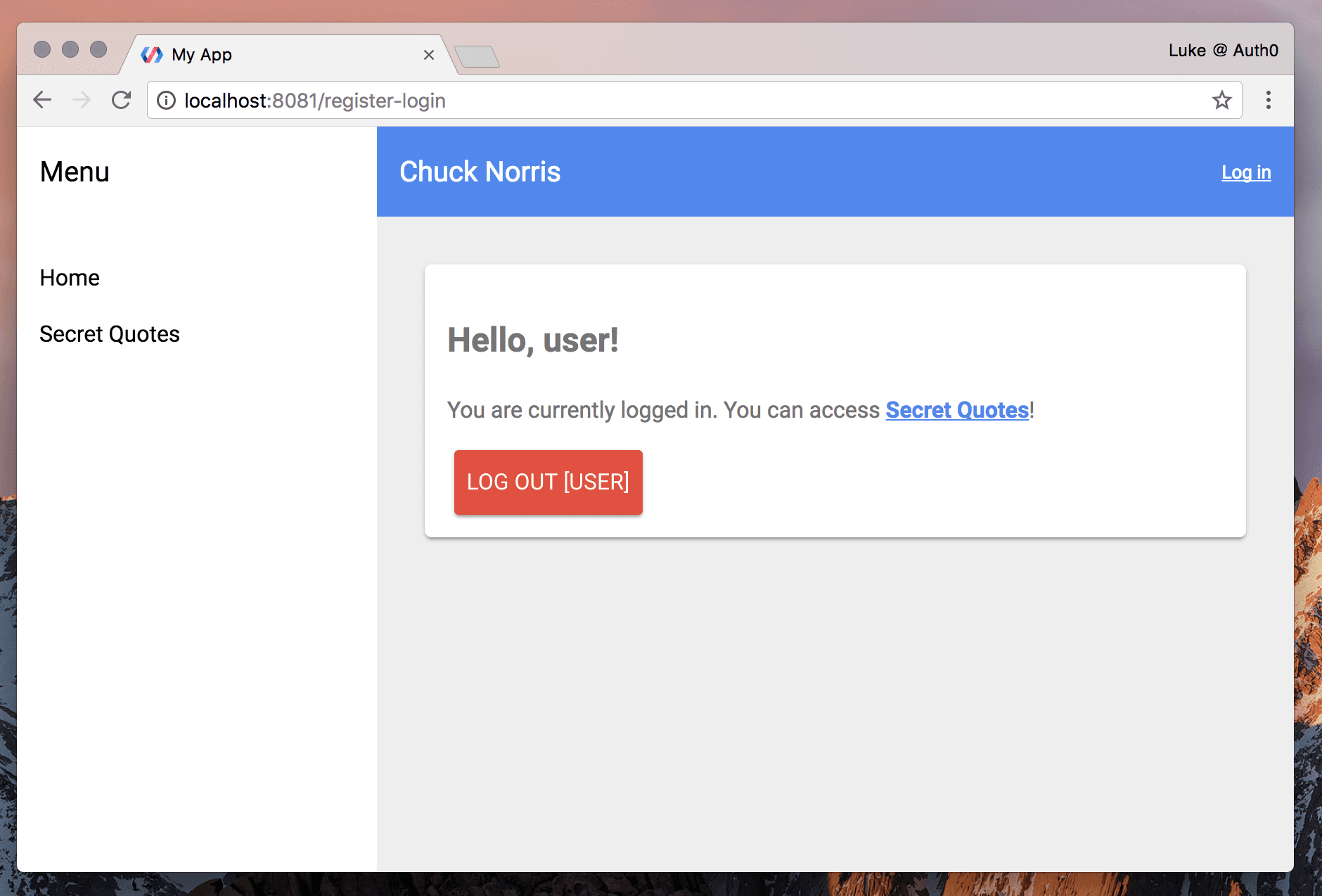
Recall that after login, users are redirected to the secret-quotes view. We’ll replace the “Log In” link in the header shortly. However, the /register-login route will be accessible regardless of authentication state: the user can access it via the URL or the browser Back button. If they visit this route while logged in, they’ll see this message and be able to log out.
Fetching Secret Quotes
It’s time to access the protected API to get secret quotes. When we’re finished with this step, our app will look like this:
Open /src/secret-quotes.html and add the following dependencies: iron-ajax, iron-localstorage, paper-button, and brum-global-variable. Clean up the contents of the <div class="card"> element:
<!-- secret-quotes.html -->

<link rel="import" href="../bower_components/polymer/polymer-element.html">
<link rel="import" href="../bower_components/iron-ajax/iron-ajax.html">
<link rel="import" href="../bower_components/iron-localstorage/iron-localstorage.html">
<link rel="import" href="../bower_components/paper-button/paper-button.html">
<link rel="import" href="shared-styles.html">
...
<div class="card">
	<h1>Secret Quotes</h1>
</div>
...
Add the iron-localstorage and brum-global-variable elements:
<iron-localstorage
  name="user-storage"
  value="{{storedUser}}"
  on-iron-localstorage-load="initStoredUser"></iron-localstorage>

<brum-global-variable key="userData" value="{{storedUser}}"></brum-global-variable>
We’ll use the on-iron-localstorage-load event to get a quote automatically if an authenticated user enters the app on this page.
Next add iron-ajax:
<iron-ajax
  id="getSecretQuoteAjax"
  method="get"
  url="http://localhost:3001/api/protected/random-quote"
  handle-as="text"
  last-response="{{secretQuote}}"></iron-ajax>
This looks similar to the iron-ajax element we used to get public quotes in the home-quotes element except that we’re not using the auto attribute. We’ll add authorization to this request in the JS when we generate the request.
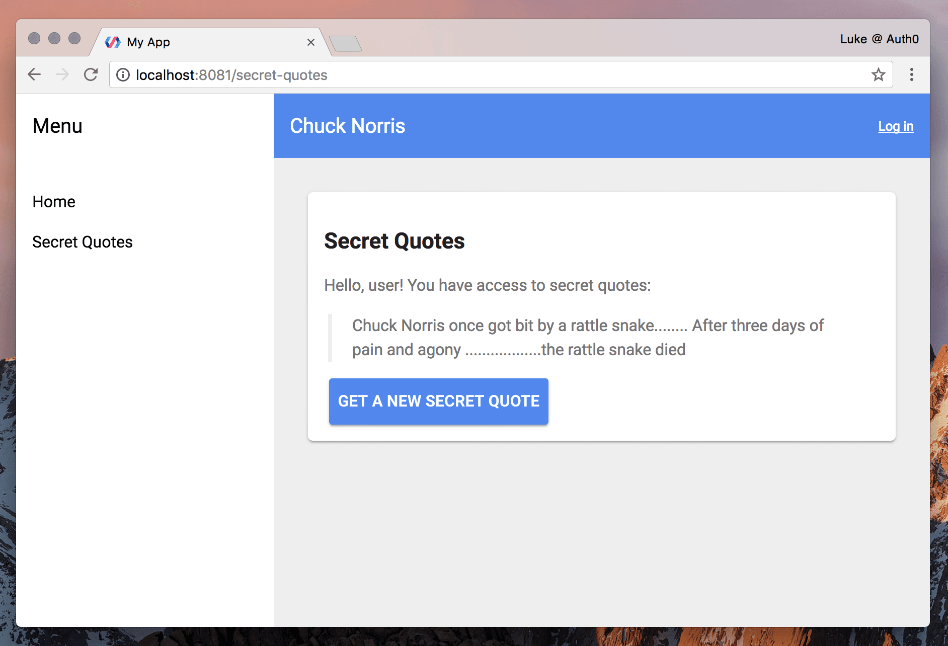
We’ll display the quotes in the UI. We want to show authenticated users a greeting and private quotes. If an unauthenticated user visits this route, we should show a message instructing them to log in:

Add the following markup:
<div class="card">
  <h1>Secret Quotes</h1>

  <div hidden$="[[!storedUser.loggedin]]">
    <p>Hello, [[storedUser.name]]! You have access to secret quotes:</p>
    <blockquote>[[secretQuote]]</blockquote>
    <paper-button class="primary" raised on-tap="getSecretQuote">Get a New Secret Quote</paper-button>
  </div>

  <p hidden$="[[storedUser.loggedin]]">You must <a href="[[rootPath]]register-login">log in</a> to access secret quotes!</p>
</div>
We can use hidden because although the authenticated content is stamped in the template on initiation, unauthenticated users cannot access the protected quotes API.
Note: Using
hiddenis much faster than creating and destroying elements withdom-if, which can cause noticeable runtime latency. You can read more about this in the dom-if Polymer docs.
In JS, add the storedUser property, initStoredUser(), and getSecretQuote():
class SecretQuotes extends Polymer.Element {
    static get is() { return 'secret-quotes'; }

    static get properties() {
        return {
            storedUser: Object
        };
    }

    initStoredUser() {
        // if entering site on the secret quotes page, verify if logged in and if so, preload a secret quote
        if (this.storedUser.loggedin) {
            this.getSecretQuote();
        }
    }

    getSecretQuote() {
        // add token authorization and generate Ajax request
        this.$.getSecretQuoteAjax.headers['Authorization'] = 'Bearer ' + this.storedUser.access_token;
        this.$.getSecretQuoteAjax.generateRequest();
    }
}

window.customElements.define(SecretQuotes.is, SecretQuotes);
getSecretQuote() is executed when the user clicks the button to fetch a new quote from the API. We’ll use the generateRequest() method and provide an Authorization header with the user’s access token.
Authenticated users can now get secret quotes!
Header and Menu States
The last thing we’ll do is improve the user experience. When the user is logged in, let’s hide the Secret Quotes link and add a greeting and log out link in the header.
Open /src/my-app.html. Import iron-localstorage, brum-global-variable, and log-out dependencies and add the <iron-localstorage> and <brum-global-variable> elements to the DOM:
<!-- my-app.html -->
...
<link rel="import" href="../bower_components/brum-global-variable/brum-global-variable.html">
<link rel="import" href="../bower_components/iron-localstorage/iron-localstorage.html">
<link rel="import" href="log-out.html">
...
<iron-localstorage name="user-storage" value="{{storedUser}}"></iron-localstorage>
<brum-global-variable key="userData" value="{{storedUser}}"></brum-global-variable>
Hiding “Secret Quotes” in the Menu
Locate the <iron-selector> element inside the <app-drawer>. Each <a> tag needs to be wrapped in its own container element in order to be hidden and shown conditionally. You can read more about iron-selector here.
Change the code to:
...
<div name="home-quotes">
  <a href="[[rootPath]]home-quotes">Home</a>
</div>
<div name="secret-quotes" hidden$="[[!storedUser.loggedin]]">
  <a href="[[rootPath]]secret-quotes">Secret Quotes</a>
</div>
...
As you can see, we’ve moved the name attributes to the containing divs and added a hidden attribute to the Secret Quotes link.
The result is that we no longer see a link to the secret-quotes page while we are logged out.
Authentication State in the Header
We want our logged in user to see something like this in the app header:

Let’s update the <app-header> to show the “Log In” link when the user is logged out and a greeting with the log-out element when authenticated.
...
<app-header condenses reveals effects="waterfall">
  <app-toolbar>
    ...
    <a name="register-login" href="[[rootPath]]register-login" hidden$="[[storedUser.loggedin]]">Log in</a>
    <div hidden$="[[!storedUser.loggedin]]">
      <span class="greeting">Hi [[storedUser.name]]!</span>
      <log-out stored-user="{{storedUser}}" link></log-out>
    </div>
  </app-toolbar>
</app-header>
...
Add the storedUser object to the Polymer properties in the JS:
class MyApp extends Polymer.Element {
    static get is() { return 'my-app'; }

    static get properties() {
        return {
            ...
            storedUser: Object,
        };
    }
    ...
}

window.customElements.define(MyApp.is, MyApp);
Finally, we’ll add some CSS in the <style> block:
...
app-header .greeting,
app-header a {
  color: #fff;
  font-size: 13px;
}
app-header .greeting {
  border-right: 1px solid rgba(255,255,255,.5);
  display: inline-block;
  padding-right: 6px;
}
We now have a functioning user state in the global header. When we log in or out, no matter what view we’re on, the header and menu will update according to authentication status.
Aside: Authenticating a Polymer App with Auth0
Let’s explore authenticating the client side of a Polymer app with a more robust solution. We’ll do a quick implementation of Auth0’s Centralized Login Page to manage user identity. We’ll leverage local storage and the brum-global-variable package again to ensure users aren’t logged out unexpectedly. You can clone the full code from this GitHub repo.
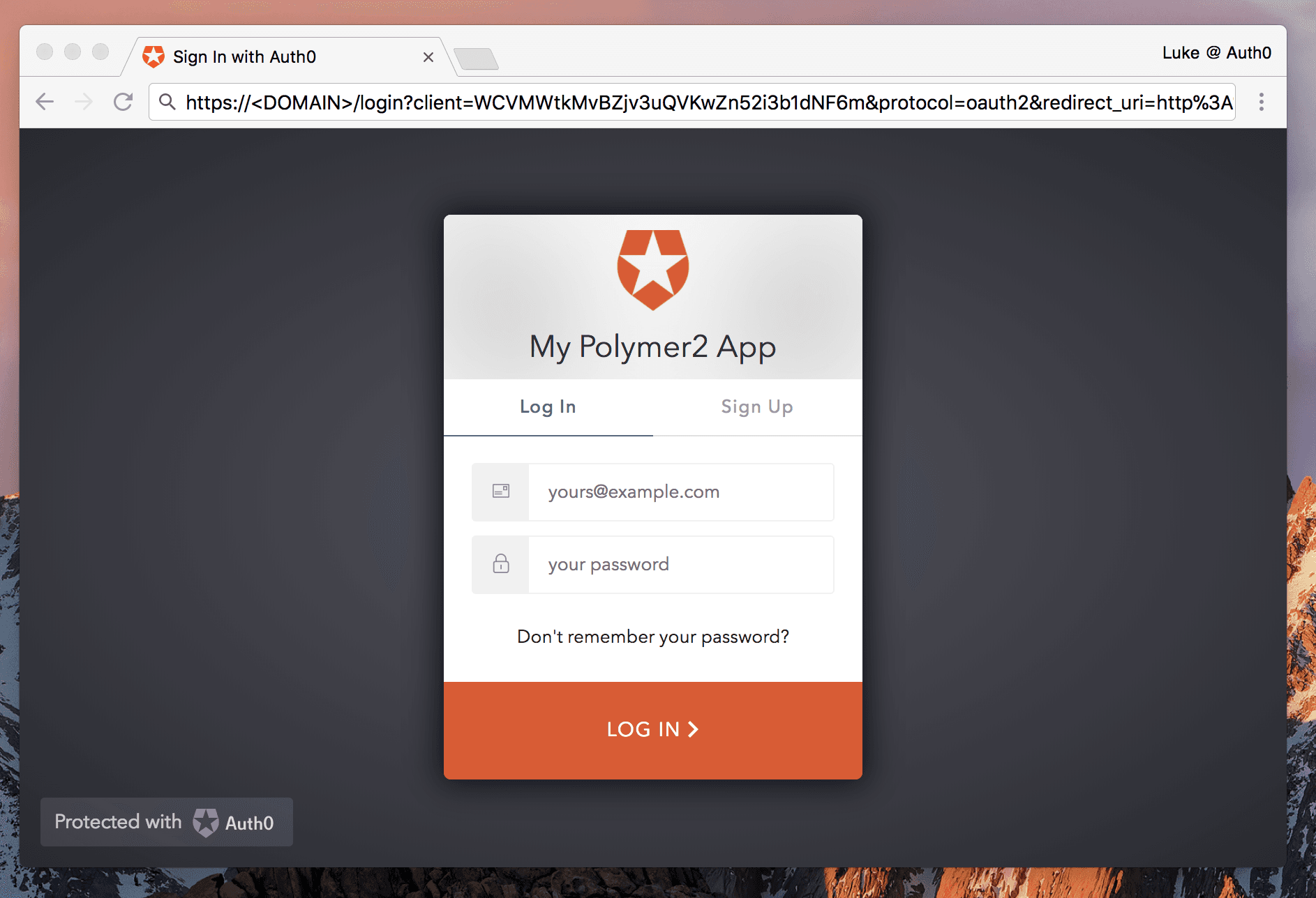
When users are logged in, they’ll see something like this:

Sign Up for Auth0
You’ll need an Auth0 account to manage authentication. You can sign up for a free account here. Next, set up an Auth0 Client and API so Auth0 can interface with your app and API.
Set Up a Client App
- Go to your Auth0 Dashboard and click the ”create a new client” button.
- Name your new app and select “Single Page Web Applications”.
- In the Settings for your newly created app, add
http://localhost:8081to the Allowed Callback URLs and Allowed Logout URLs. - If you’d like, you can set up some social connections. You can then enable them for your app in the Client options under the Connections tab. The example shown in the screenshot above utilizes username/password database, Facebook, Google, and Twitter.
Setup and Dependencies
Create a new directory, init a fresh Polymer starter kit app, then serve it:
polymer init starter-kit
polymer serve --open
Creating the Auth0 Login Element
Create a new file: /src/auth0-login.html. This will be our auth0-login custom element.
Our auth0-login element will include the following:
- An element containing auth0.js v9.
- A link with an event handler to open authenticate with Auth0js.
- Auth0 configuration.
- A greeting with profile image and logout button to show when the user is authenticated.
Important security note: In this demo, we’re adding authentication to the client side but we are not securing a backend. If you have an API for your application, the API should always be secured. The
id_tokenshould not be used to secure an API; instead, use anaccess_tokenwith the appropriate configuration. You can read about how to implement API authentication with Auth0 with implicit grant.
Let’s create the dependency element: /src/auth0-js.html. Create a new file and add the following:
<!-- auth0-js.html -->
<script src="https://cdn.auth0.com/js/auth0/9.0.0/auth0.min.js"></script>
This is best practice in Polymer for loading third party dependencies. This way, we can use HTML import to load this file and be certain that it will only be imported once. If it’s called again, it will be deduped.
Now we can build /src/auth0-login.html:
<!-- auth0-login.html -->

<link rel="import" href="../bower_components/polymer/polymer-element.html">
<link rel="import" href="../bower_components/iron-localstorage/iron-localstorage.html">
<link rel="import" href="../bower_components/brum-global-variable/brum-global-variable.html">
<link rel="import" href="../bower_components/paper-button/paper-button.html">
<link rel="import" href="auth0-js.html">

<dom-module id="auth0-login">
  <template>
    <style>
      :host {
        color: #fff;
        font-size: 13px;
      }
      .greeting {
        border-right: 1px solid rgba(255,255,255,.5);
        display: inline-block;
        padding-right: 6px;
      }
      .greeting img {
        border-radius: 100px;
        display: inline-block;
        height: 24px;
        margin-right: 4px;
        vertical-align: middle;
        width: 24px;
      }
      a {
        color: #fff;
      }
      paper-button {
        color: #fff;
      }
      paper-button.link {
        color: #fff;
        display: inline-block;
        font-size: 13px;
      }
      paper-button.indigo {
        background-color: var(--paper-indigo-500);
        color: white;
        --paper-button-raised-keyboard-focus: {
          background-color: var(--paper-pink-a200) !important;
          color: white !important;
        };
      }
      paper-button.indigo:hover {
        background-color: var(--paper-indigo-400);
      }
    </style>

    <iron-localstorage
      name="user-storage"
      value="{{storedUser}}"
      on-iron-localstorage-load="_setProfileImg"></iron-localstorage>

    <brum-global-variable key="userData" value="{{storedUser}}"></brum-global-variable>

    <paper-button class="link" on-tap="authorize" hidden$="[[storedUser.loggedin]]">Log In</paper-button>

    <div hidden$="[[!storedUser.loggedin]]">
      <span class="greeting"><img src="[[profileImgSrc]]">[[storedUser.profile.nickname]]</span>
      <paper-button class="link" on-tap="logOut">Log Out</paper-button>
    </div>
  </template>
  <script>
      (function() {
          const webAuth = new auth0.WebAuth({
              domain: '<DOMAIN>',
              clientID: '<CLIENTID>',
              responseType: 'token',
              redirectUri: '<REDIRECT_URI>'
          });

          class Auth0Login extends Polymer.Element {
              static get is() { return 'auth0-login'; }

              static get properties() {
                  return {
                      storedUser: Object,
                      profileImgSrc: {
                          type: String,
                          value: ''
                      }
                  }
              }

              connectedCallback() {
                  super.connectedCallback();
                  const _self = this;

                  // Parse the hash
                  if (window.location.hash) {
                      webAuth.parseHash({ hash: window.location.hash }, function(error, authResult) {
                          if (error) {
                              console.error('Error reading hash:', error);
                              return;
                          }

                          if (authResult) {
                              webAuth.client.userInfo(authResult.accessToken, function(error, profile) {
                                  if (error) {
                                      console.error('Error getting profile:', error);
                                      return;
                                  }

                                  _self.storedUser = {
                                      name: profile.name,
                                      id_token: authResult.idToken,
                                      access_token: authResult.accessToken,
                                      loggedin: true,
                                      profile: profile
                                  };
                                  _self.profileImgSrc = profile.picture;
                              });
                          }
                      });
                  }
              }

              _setProfileImg() {
                  this.profileImgSrc = this.storedUser.profile.picture;
              }

              authorize() {
                  webAuth.authorize();
              }

              logOut() {
                  this.storedUser = null;
                  this.profileImgSrc = '';
              }
          }

          window.customElements.define(Auth0Login.is, Auth0Login);
      }());
  </script>
</dom-module>
Make sure you update your auth0.js configuration. To get your client ID and domain, find your app in the Auth0 Dashboard and look in Settings. Your redirect uri will be http://localhost:8081.
const webAuth = new auth0.WebAuth({
    domain: '<DOMAIN>.auth0.com',
    clientID: '<CLIENTID>',
    responseType: 'token',
    redirectUri: 'http://localhost:8081'
});
You can read all about auth0.js in the Auth0’s Centralized Login Page docs.
Note: We’re setting the profile image with JS rather than binding directly to
storedUser.profile.picturebecause if we don’t, the imagesrcwill populate asundefinedand result in a 404 network error when not set.
We now have an auth0.js element that can be launched by clicking a “Log In” button. We need to place it in our app and pass in the appropriate Auth0 configuration.
Adding auth0.js to a Polymer App
Open /src/my-app.html and import the iron-localstorage, brum-global-variable, and auth0-login dependencies. Add the <iron-localstorage> and <brum-global-variable> elements to the DOM and add the storedUser object to the Polymer properties in the JS.
<!-- my-app.html -->
...
<link rel="import" href="../bower_components/iron-localstorage/iron-localstorage.html">
<link rel="import" href="../bower_components/brum-global-variable/brum-global-variable.html">
<link rel="import" href="auth0-login.html">
...
<iron-localstorage name="user-storage" value="{{storedUser}}"></iron-localstorage>
<brum-global-variable key="userData" value="{{storedUser}}"></brum-global-variable>
...
<script>
    class MyApp extends Polymer.Element {
        static get is() { return 'my-app'; }

        static get properties() {
            return {
                ...
                storedUser: Object,
            };
        }
...
</script>
...
Now we’ll add our <auth0-login> element to the DOM. We want to display the “Log In” link/user greeting in the header, just like we did in the Chuck Norris app.
...
<app-header condenses reveals effects="waterfall">
  <app-toolbar>
    <paper-icon-button icon="menu" drawer-toggle></paper-icon-button>
    <div main-title>My App</div>

    <auth0-login></auth0-login>

  </app-toolbar>
</app-header>
...
Now users can sign up for an account, log in, and log out. You can utilize the techniques we learned earlier to access protected API routes, show and hide UI, set up redirection, and more. Check out the Auth0 Docs to read about features, APIs, guides, and more.
The Future of Web (Components)
The beauty of web components is that they’re composed of native DOM features: they’re literally the future of the web. Web developers have a long history of struggling with DOM encapsulation and CSS scoping—and subsequently inventing paradigms to compensate. Web components offer solutions.
Remember that Polymer itself is not a framework. It’s a library to facilitate easy, compatible web component usage. When you use Polymer, your framework is the DOM. It’s also important to know that JS frameworks like Angular 2 are currently leveraging web component concepts.
Web components may be the future, but there’s no reason not to get started with them today. Google uses Polymer in many of its sites, GitHub uses web components, and there are many others leveraging these technologies. Custom elements are being built and shared with the community every day. In addition to Google’s Polymer Element Catalog, developers can take advantage of element libraries like Vaadin.
Polymer delivers a way to use web components cross-browser while learning the native spec at the same time. Learning Polymer isn’t like tackling a massive JS framework: it’s a veneer over native features. You can build something simple or complex with web components. Polymer is intuitive to learn and the experience with web components will be invaluable for many projects, frameworks, and libraries to come.